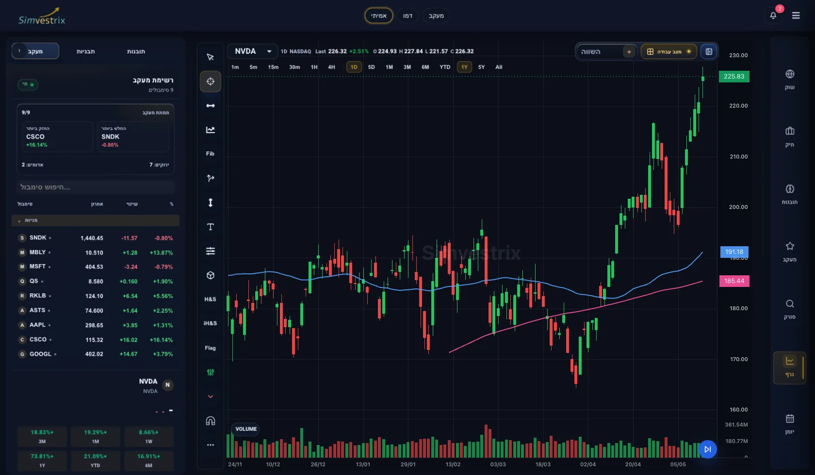
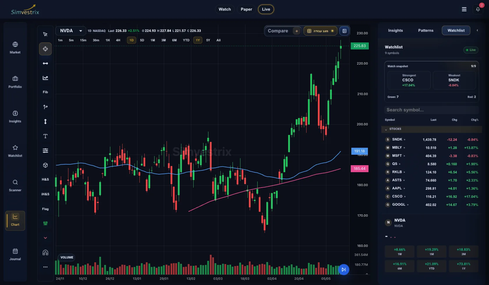
A stock chart analysis tool either sharpens your process or slows it down. Most active traders do not struggle because they lack charts. They struggle because their charting sits in one place, their watchlist in another, their notes somewhere else, and their risk view nowhere useful. That gap matters more than another indicator.
For independent traders, the real question is not whether a platform can draw candles and overlay moving averages. Almost every platform can. The better question is whether the tool helps you move from market observation to trade decision to review without losing context. If it does, it becomes part of your operating process. If it does not, it becomes another tab to manage.
What a stock chart analysis tool should actually do
At a minimum, a charting tool should help you read price action clearly, compare setups fast, and monitor conditions that affect risk. That sounds basic, but there is a wide gap between a chart that looks good and a charting environment that supports disciplined decision-making.
A useful tool organizes market structure in a way that reduces hesitation. You should be able to identify trend direction, support and resistance, relative strength, volatility shifts, and event-driven pressure without building a workaround for each step. When a platform forces you to jump between disconnected views just to confirm a setup, speed drops and execution quality usually follows.
This is why advanced traders often outgrow standalone chart packages. They do not just need visual analysis. They need connected analysis. A chart matters most when it is tied to the rest of the workflow - the watchlist that surfaced the symbol, the trade plan that defines the entry, the position view that shows exposure, and the journal that captures the result.
The difference between charting features and trading utility
Feature lists can be misleading. More indicators do not automatically produce better decisions. More layouts do not guarantee better market coverage. A stock chart analysis tool is only as effective as its ability to support repeatable action.
For example, if you trade swing setups, multi-timeframe visibility matters more than novelty. You need to assess daily structure, then zoom into intraday behavior for timing. If you monitor several positions at once, alert logic and watchlist organization may matter more than advanced drawing tools. If you review performance seriously, annotated charts tied to completed trades are more valuable than cosmetic customization.
This is where utility becomes the standard. The strongest tool is not the one with the longest menu. It is the one that reduces friction between analysis and execution support.
How active traders should evaluate a stock chart analysis tool
Start with chart clarity. Price, volume, and overlays should be readable immediately. If the interface makes basic interpretation harder than it should be, that problem compounds under market pressure. Clean visual hierarchy is not a design luxury. It affects speed and focus.
Next, look at timeframe flexibility. Most active traders do not operate on a single horizon. They scan broad trends, refine entries, and manage exits across multiple views. A platform should make that transition fast enough that context stays intact.
Then test market coverage against your actual workflow. If you trade stocks but also track ETFs, sectors, or macro proxies, your charting environment should make that cross-reference easy. A setup rarely exists in isolation. Relative context often determines whether a chart pattern is actionable or weak.
Finally, evaluate what happens after the chart. Can you move from a watched symbol to a trade note, then back to the chart with your reasoning preserved? Can you track whether a setup type is working over time? Can you review missed trades or poor exits with the original chart context available? If the answer is no, you are not evaluating a workflow tool. You are evaluating a visual component.
Why disconnected tools create avoidable mistakes
Many traders build a stack over time: one app for charting, one for alerts, one spreadsheet for tracking, one journal for review, and maybe a separate dashboard for portfolio exposure. It can work for a while, especially when activity is low. But as trade frequency or complexity rises, fragmentation starts to show.
The first cost is time. Re-entering the same symbol, thesis, or position details across tools adds more drag than most traders admit. The second cost is inconsistency. Notes get skipped. Position sizing assumptions change. Performance review becomes partial because the relevant data lives in different places. The third cost is decision quality. When chart analysis is detached from risk and review, traders often overemphasize setup quality and underweight process quality.
That is why an integrated workspace is more than a convenience upgrade. It changes how consistently a trader can operate. Simvestrix is built around that idea: charting should not sit apart from watchlists, journaling, portfolio tracking, and risk oversight. The value is not just fewer tabs. It is better control.
The best chart analysis setups are tied to process
A chart does not produce edge by itself. Edge comes from how consistently you interpret recurring conditions, how well you define invalidation, and how honestly you review outcomes. That process can be structured inside the tool or left to memory. Serious traders know which option scales better.
If your stock chart analysis tool lets you capture setup type, entry rationale, key levels, and post-trade outcome in one system, it becomes much easier to identify patterns in your own behavior. You stop asking only, "Was this a good-looking chart?" and start asking, "Do I execute this setup well? Does it perform better in certain market conditions? Am I managing risk consistently when volatility expands?"
Those are better questions. They move charting from observation to operational feedback.
What matters most by trading style
The right tool depends on how you trade. For swing traders, daily and weekly structure usually carry more weight than ultra-fast execution features. Clean trend analysis, watchlist prioritization, and position monitoring are often more important than dense intraday customization.
For active investors, the charting environment should support decision context across holdings, not just individual entries. Sector behavior, portfolio concentration, and drawdown visibility all matter because chart setups interact with broader exposure.
For more tactical traders, responsiveness matters more. The platform needs to help you read short-term shifts quickly while still maintaining enough structure for review. That balance is not always easy to find. Some tools are fast but weak on recordkeeping. Others are comprehensive but too slow for active management.
This is where trade-offs matter. There is no universal best platform in the abstract. There is only the best fit for the kind of analysis, monitoring, and review you actually perform.
Signs your current charting setup is holding you back
Sometimes the problem is not obvious because the tools technically work. The better test is whether your system supports consistent behavior.
If you routinely miss review notes because they live outside your charting tool, that is a process problem. If your watchlist and chart layouts are disconnected, your idea flow is weaker than it should be. If you can analyze a chart but cannot easily see how the trade affects portfolio risk, your market read is only partially useful.
Another warning sign is overcustomization without accountability. Traders often add more indicators, more saved layouts, and more screens when the real issue is lack of structure. A tool should help simplify signal reading and support repeatable decisions. If it encourages visual clutter but does little for review or risk control, it may be adding confidence without adding discipline.
How to choose with fewer regrets
Focus less on what looks impressive in a demo and more on what stays useful after a month of real trading. Test how quickly you can move through a normal routine: scan, open a chart, compare timeframes, flag a setup, log your reasoning, monitor the position, and review the result. That sequence tells you more than any feature page.
Pay attention to whether the tool helps you stay organized when markets get busy. Calm conditions make almost every platform seem adequate. The real test is whether your workspace still supports clarity when multiple positions are moving, alerts are firing, and risk needs active attention.
A good stock chart analysis tool should reduce noise, not just display data. It should support cleaner decisions, tighter review loops, and stronger control over your own process. For independent traders, that is the difference between having charts and having infrastructure.
Choose the tool that makes discipline easier to maintain when the market stops being cooperative.