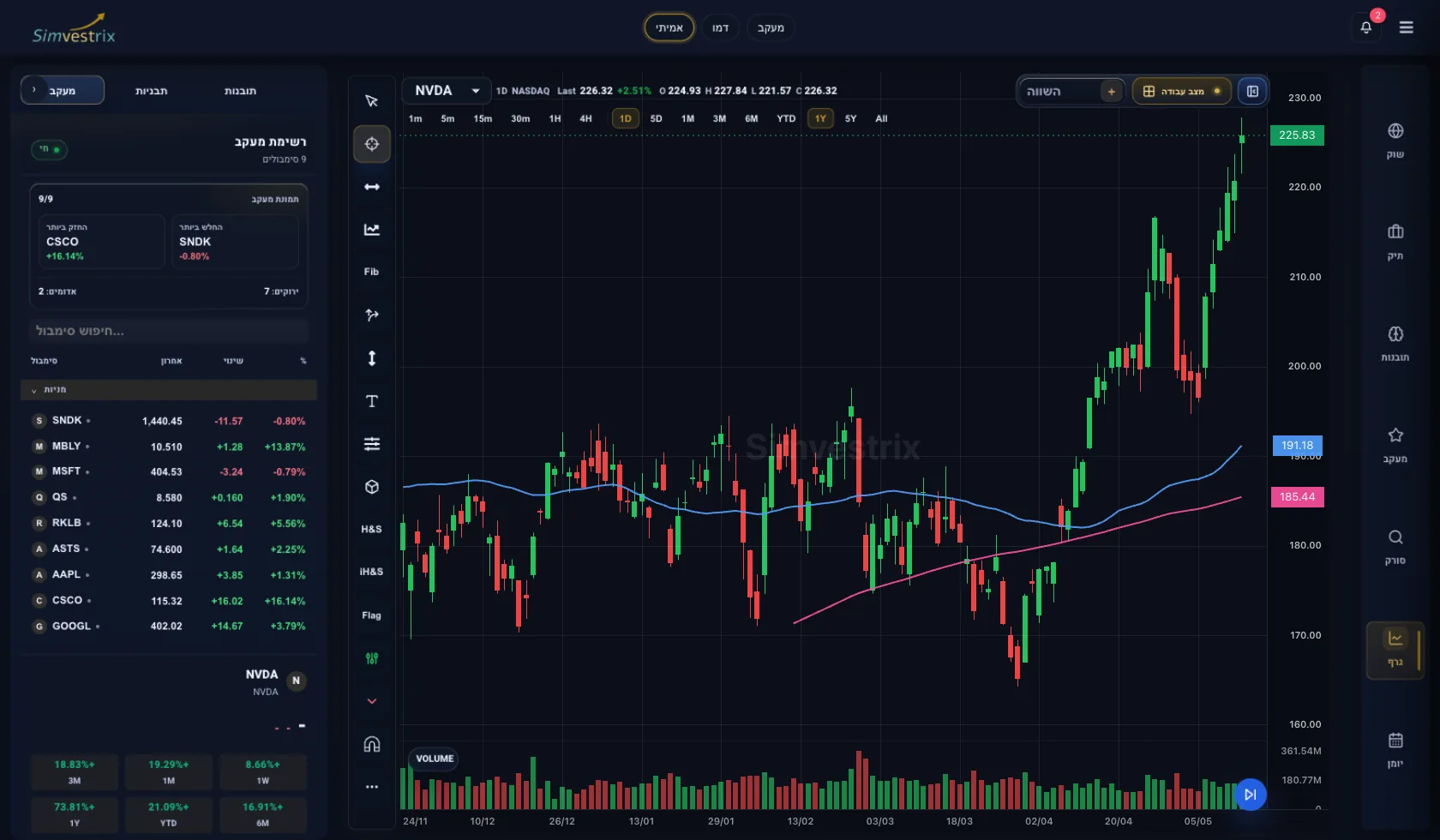
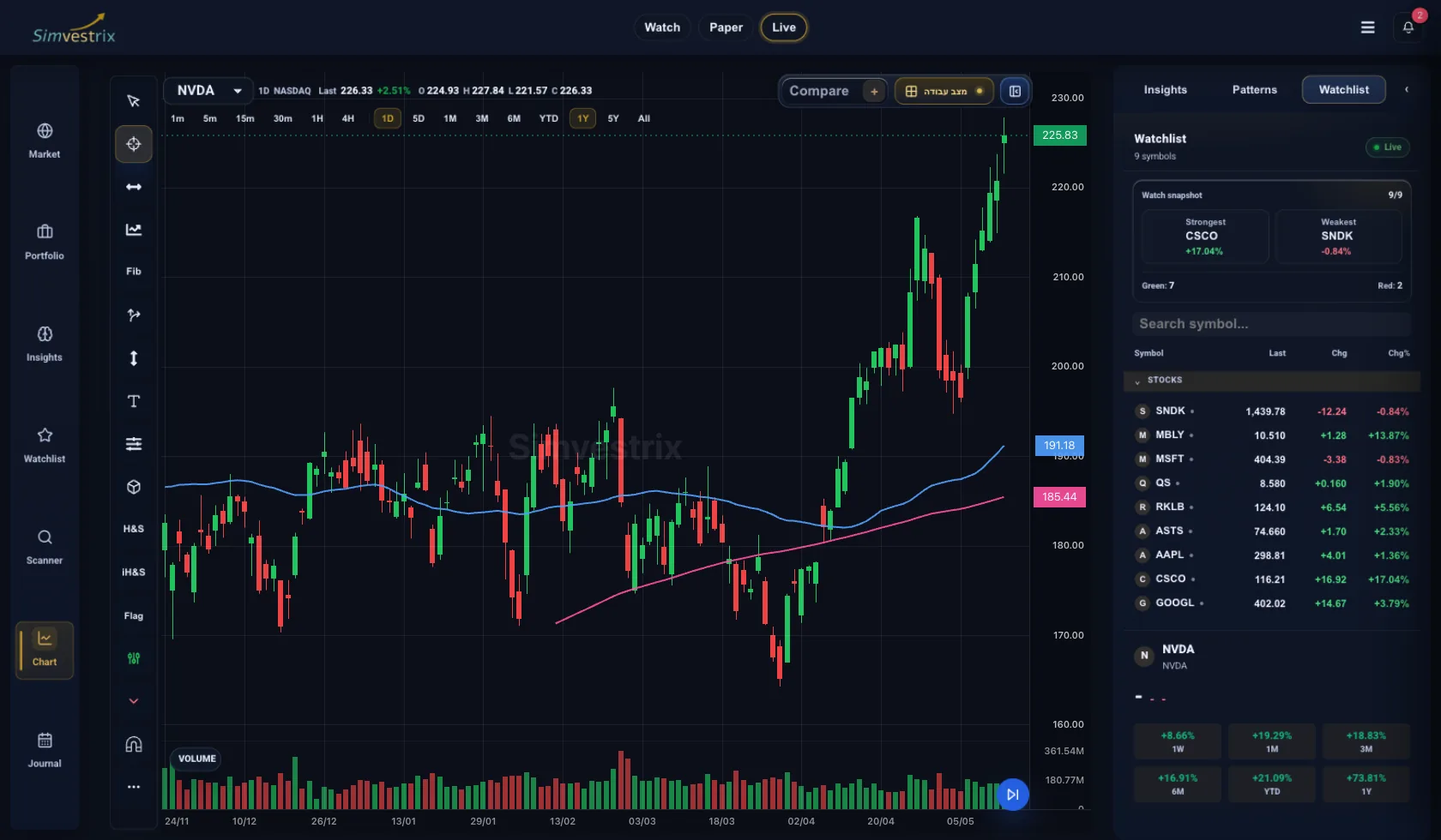
Most chart mistakes happen before a trader draws a single line. They happen when you open a chart with no process, flip through timeframes, spot a pattern you want to believe, and build a trade around a weak read. If you want to learn how to analyze a stock chart with consistency, the goal is not to predict every move. It is to build a repeatable framework that helps you read trend, structure, participation, and risk quickly.
A chart is not just price history. It is a record of behavior. Buyers and sellers leave footprints in trend changes, failed breakouts, heavy-volume reversals, and areas where price repeatedly stalls. Reading those signals well takes less guesswork than most traders think, but it does require structure.
How to analyze a stock chart without guessing
The cleanest way to approach a chart is to move from broad context to specific setup. Start with the higher timeframe, define the trend, mark the important price zones, then drop into the execution timeframe only after the bigger picture is clear. Traders who reverse that order often end up trading noise.
Begin with one basic question: what is price doing overall? An uptrend is making higher highs and higher lows. A downtrend is making lower highs and lower lows. A range is moving sideways between clear support and resistance. This sounds elementary, but it filters out a surprising amount of bad decision-making. If the daily chart is choppy and directionless, a clean pattern on the 15-minute chart may not be worth much.
Trend also has degrees. A strong trend usually shows orderly pullbacks and decisive continuation. A weak trend tends to overlap, stall, and reverse sharply. That difference matters. Strong trends often reward patience on pullbacks. Weak trends can trap traders who mistake drift for momentum.
Step 1: Start with trend and market structure
Price structure gives the chart its logic. Instead of asking whether a stock "looks bullish," ask whether the structure supports that view. Has it broken a prior swing high? Did a pullback hold above the last breakout area? Is the stock reclaiming a key level after undercutting it?
This is where context matters more than pattern names. A flag, triangle, or double bottom only matters if it appears in the right environment. A bull flag inside a strong daily uptrend after expansion in price and volume is different from a bull flag that forms after a long, weak grind into resistance. Same shape, different quality.
When analyzing structure, mark the swing highs and swing lows that clearly influenced price. You are not trying to decorate the chart. You are identifying the points where control changed hands. Those areas often define where traders become trapped, defend positions, or re-enter.
Support and resistance are decision zones, not exact prices
Many traders treat support and resistance like precise numbers. Markets usually do not. These areas work more like zones where order flow tends to show up. A stock may dip below support intraday and recover by the close. It may push above resistance, pause, and only then confirm a breakout.
That is why reaction matters more than touch. If price reaches a level and rejects it immediately on volume, that tells you something. If it slices through with no friction, that tells you something else. The level itself is only part of the analysis. The behavior around it is what gives it value.
Step 2: Use volume to test conviction
Price tells you what happened. Volume helps you judge how much commitment was behind the move. A breakout above resistance on weak volume can still work, but it deserves more skepticism than a breakout supported by clear participation. Likewise, a selloff on heavy volume often carries more information than a red day on light trade.
Volume is especially useful at turning points. If a stock falls into support on declining volume, selling pressure may be fading. If it rallies into resistance on shrinking volume, the move may be running out of sponsorship. None of this works in isolation, but volume often confirms whether price action has real intent behind it.
Relative volume also matters. A stock trading at two or three times its normal activity is telling you institutions, news, or concentrated interest may be involved. That changes the quality of the move. It can create opportunity, but it can also increase volatility and widen the range you need to respect.
Step 3: Add moving averages carefully
Moving averages are useful if you treat them as context tools, not signals by themselves. A rising 20-day or 50-day moving average can show trend health and dynamic support. Price holding above those levels during pullbacks may support a continuation case. But a moving average should not override what raw price is already showing.
Different traders overload charts with indicators because they want certainty. Usually they get conflict instead. If the chart is trending cleanly, support and resistance are obvious, and volume confirms the move, you may not need much else. The more tools you add, the more disciplined you need to be about what each one is actually contributing.
For many active traders, a small set is enough: price, volume, one or two moving averages, and maybe a momentum measure for divergence or exhaustion. Beyond that, your edge often comes from process, not indicator count.
Step 4: Analyze across timeframes
Multi-timeframe analysis is where many traders either sharpen their edge or create confusion. The purpose is not to find different opinions on every chart. The purpose is alignment.
A practical approach is to use the daily chart for primary structure, the hourly chart for setup development, and a lower timeframe only for execution if needed. If the daily trend is up and the hourly chart is pulling back into support, you may be looking at a continuation opportunity. If the daily chart is running directly into major resistance, that same hourly pullback setup becomes less attractive.
Timeframes should work together. When they do not, risk usually rises. A lower timeframe breakout against a weak higher timeframe backdrop can still work, but expectations should be tighter. Maybe it is a shorter tactical trade rather than a swing position. Good chart analysis is not just about identifying opportunity. It is about matching the setup to the right holding period and risk profile.
Beware of pattern bias
Once traders learn a handful of chart patterns, they start seeing them everywhere. That is a problem. Patterns are descriptive, not predictive. A head and shoulders, cup and handle, or wedge means little if the surrounding context is poor.
Ask tougher questions. Did the stock expand before consolidating? Is the base tight or sloppy? Is the breakout occurring near a major overhead supply zone? Is the market itself supportive? The more context a pattern ignores, the more likely it is to fail when real pressure arrives.
Step 5: Frame the risk before the trade
The best chart read is still incomplete if it does not translate into a defined risk decision. Once you identify a trend, a level, and a possible setup, the next question is simple: where is the trade wrong?
That invalidation point matters more than the entry fantasy. If you cannot define where your thesis breaks, you are not analyzing a chart. You are narrating one. A clean setup usually has a logical level that should hold if your read is correct, such as a recent higher low, a breakout level, or the low of a base.
This is also where chart quality meets position sizing. A wide, volatile chart may offer opportunity, but it may force smaller size because the stop has to be wider. A tighter chart may allow better efficiency. There is no universal best setup. It depends on your risk budget, timeframe, and ability to manage noise without getting shaken out.
In a connected trading workflow, this step is where chart analysis becomes far more useful. Marking levels is one thing. Tracking how your entries, exits, stop placement, and post-trade review relate to those levels is where improvement happens. That is the difference between looking at charts and building a process.
Common mistakes that weaken chart analysis
One of the most common errors is analyzing a stock in isolation from its environment. Sector strength, market direction, and earnings proximity all affect chart quality. A clean setup in a weak tape may fail simply because broad conditions are hostile. The chart still matters, but not in a vacuum.
Another mistake is forcing precision onto imperfect information. Support is a zone. Breakouts often retest. Momentum can fade before price fully rolls over. Good traders allow for normal variation instead of demanding textbook behavior.
The last major error is inconsistency. If you change indicators, timeframes, and definitions every week, your chart analysis never compounds. A disciplined routine matters more than constant experimentation. The edge comes from seeing the same variables the same way, then reviewing outcomes over time.
A stock chart will never remove uncertainty. That is not its job. What it can do is organize uncertainty into something tradable: trend, structure, participation, and risk. If you approach each chart with that sequence, you stop reacting to random movement and start making decisions with more control. That is where better trading usually begins.