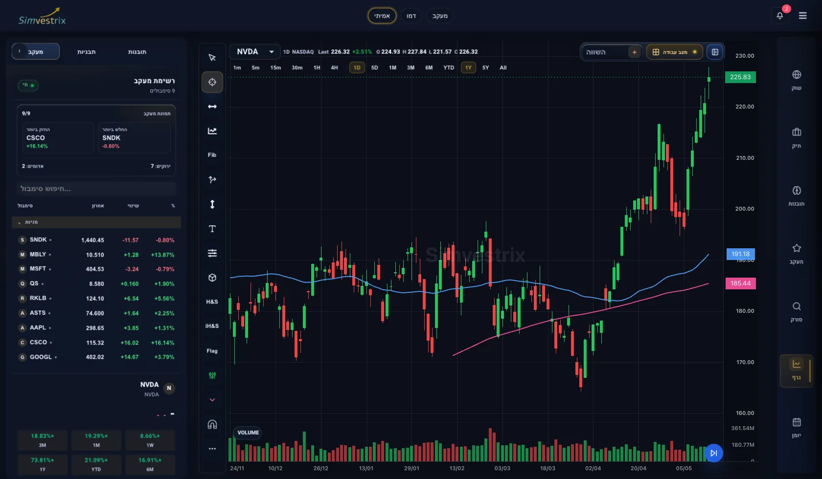
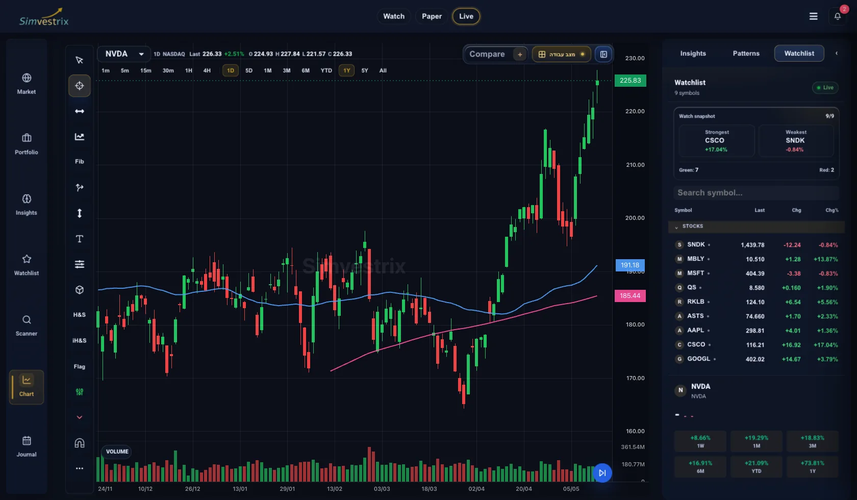
Most traders do not lose money because they cannot find a chart pattern. They lose money because they read charts without a framework. If you want to understand how to read stock charts technical analysis, start with one rule: a chart is not a prediction tool. It is a record of price behavior, participation, and decision points.
That shift matters. Once you stop treating charts like crystal balls, you can use them for what they do best - identifying trend direction, key levels, momentum changes, and areas where risk can be defined clearly.
Reading a stock chart starts with structure
Before you label patterns or draw lines, read the chart in layers. Price is first. Context is second. Indicators, if you use them, come last.
The first layer is the time frame. A daily chart and a 5-minute chart can tell completely different stories about the same stock. A swing trader may see an orderly uptrend on the daily while an intraday trader is dealing with a sharp breakdown on the 15-minute. Neither is wrong. They are operating on different horizons.
Start by asking a simple question: what time frame matches your holding period? If you plan to hold for days or weeks, the daily and weekly charts should carry more weight than intraday noise. If you are managing short-term entries, lower time frames matter more, but only after you understand the higher time frame trend.
The second layer is trend. Every chart is doing one of three things: trending up, trending down, or moving sideways. An uptrend shows higher highs and higher lows. A downtrend shows lower highs and lower lows. A range shows repeated rejection near the same resistance zone and support near the same floor.
This sounds basic because it is. But basic does not mean easy. Traders often complicate charts with too many indicators while missing the plain structure in front of them.
Read price before you read indicators
Candlesticks matter because they show the open, high, low, and close for a given period. That gives you more information than a simple line chart. A strong bullish candle closing near its high suggests buyers controlled that session. A weak candle with a long upper wick can show rejection.
Still, one candle means very little on its own. Context gives it meaning. A hammer after a prolonged decline near a major support level is different from a hammer in the middle of a messy range. A large bearish candle breaking below a well-tested floor matters more than a red candle inside a quiet consolidation.
This is where many traders overread charts. They memorize candlestick names without asking where the pattern appears, what trend came before it, and whether volume confirms it. Technical analysis works better when each signal is filtered through location and participation.
Support, resistance, and the logic of decision zones
Support and resistance are not magic lines. They are zones where buying and selling pressure previously shifted. Support is the area where demand has historically stepped in. Resistance is where supply has tended to cap advances.
The practical use is straightforward. These levels help you identify where price may stall, reverse, or accelerate. If a stock breaks above resistance on strong volume, that move can signal acceptance at higher prices. If price taps resistance and quickly fails, that tells a different story.
Treat these areas as zones, not exact pennies. Markets rarely reverse at a perfect number. A rigid line can make you miss the broader behavior. A better approach is to mark the general area where reactions have occurred multiple times.
The more often a level has been tested, the more attention it deserves. But there is a trade-off. Repeated tests can strengthen a level until it breaks. Once price pushes through decisively, the old level often flips its role. Former resistance can become support. Former support can become resistance.
Volume tells you whether the move has conviction
Price shows direction. Volume shows participation. You need both.
A breakout above resistance on low volume deserves skepticism because it may reflect limited conviction. A breakout with clear expansion in volume is more meaningful because it suggests broader market agreement. The same applies in reverse for breakdowns.
Volume also helps during pullbacks. If a stock trends higher, then pulls back on lighter volume, that often points to normal profit taking rather than aggressive selling. If the pullback arrives with heavy volume and slices through prior support, the character of the move may be changing.
Not every stock trades with clean volume signals, especially thin names. That is where judgment matters. Technical analysis is not about finding perfect confirmation every time. It is about stacking evidence.
Moving averages: a first layer, not a signal machine
Moving averages help simplify trend direction. They smooth price action so you can see whether a stock is generally trading above or below a reference level.
The 20-day, 50-day, and 200-day moving averages are common because they frame short-, intermediate-, and long-term trend behavior. If price is above a rising 50-day moving average, that usually supports a bullish intermediate trend. If price is below a declining 200-day moving average, the longer-term structure is weaker.
But moving averages are lagging tools. They describe what price has already done. They do not lead the market. That makes them useful for context and less useful as standalone buy or sell signals.
Crossovers can help, but they are often late, especially in choppy markets. A trader who buys every moving average crossover without looking at support, resistance, and volume usually ends up trading noise. Use moving averages as part of the chart, not as a substitute for reading it.
Momentum can confirm or warn
Momentum indicators such as RSI or MACD can add another layer, but only after price structure is clear. RSI can help show whether momentum is strong, weakening, or stretched. MACD can help identify trend acceleration or loss of momentum.
The mistake is treating overbought and oversold readings as automatic reversal signals. Strong stocks can stay overbought for longer than expected. Weak stocks can stay oversold while continuing lower. A high RSI during a breakout can reflect strength, not danger.
What matters more is divergence and context. If price makes a new high while momentum fails to confirm, that can be an early warning. It is not a trade by itself, but it tells you to tighten your analysis. The same is true when momentum improves while price holds support during a pullback.
Build a repeatable chart-reading process
The most effective way to read charts is the same way you manage risk - consistently. A repeatable process removes improvisation.
Start with the higher time frame. Mark the primary trend and major support and resistance zones. Then move to your execution time frame and look for alignment. Is price trending in the same direction? Is it pulling back into support or pressing into resistance? Is volume confirming the move or fading?
Next, define the trade location. Buying in the middle of a wide range usually gives you poor risk control because your stop has no logical anchor. Buying near support in an uptrend or on a confirmed breakout gives you a clearer invalidation point. That is what charts are really for - not just finding opportunity, but defining where you are wrong.
This is also where an integrated workflow matters. If your charting, watchlists, trade notes, and risk tracking all live in separate places, your analysis becomes fragmented. A structured workspace like Simvestrix helps traders connect chart observations to execution planning and post-trade review, which is where technical analysis becomes a process instead of a one-off opinion.
What newer traders usually misread
Most chart-reading errors come from forcing certainty onto uncertain data. Traders chase patterns without checking trend, buy breakouts directly into higher time frame resistance, or confuse activity with edge.
Another common mistake is using too many indicators. When price, volume, moving averages, RSI, MACD, VWAP, and five custom studies all disagree, the chart is not more informative. It is less usable. Keep only the tools that improve decisions.
There is also the issue of market regime. A clean breakout strategy works better in trending markets than in choppy, headline-driven conditions. Mean reversion setups can work in ranges and fail badly in strong momentum environments. Charts do not exist in a vacuum. The same setup can behave differently depending on broader conditions.
A good chart reader does not ask, "Is this pattern valid?" They ask, "What is the market context, where is the invalidation level, and does the reward justify the risk?"
The goal is not prediction. It is control.
Technical analysis is often framed as a way to forecast where a stock will go next. That is the wrong standard. The real value of chart reading is operational. It helps you identify structure, improve timing, define risk, and review whether your decisions were disciplined.
That is why the best traders do not just stare at charts longer. They read them more systematically. They know what they are looking for before they open the chart, and they know what would prove them wrong before they enter the trade.
If you approach charts that way, you do not need perfect foresight. You need a clean process, clear levels, and the discipline to act only when price behavior supports the setup.